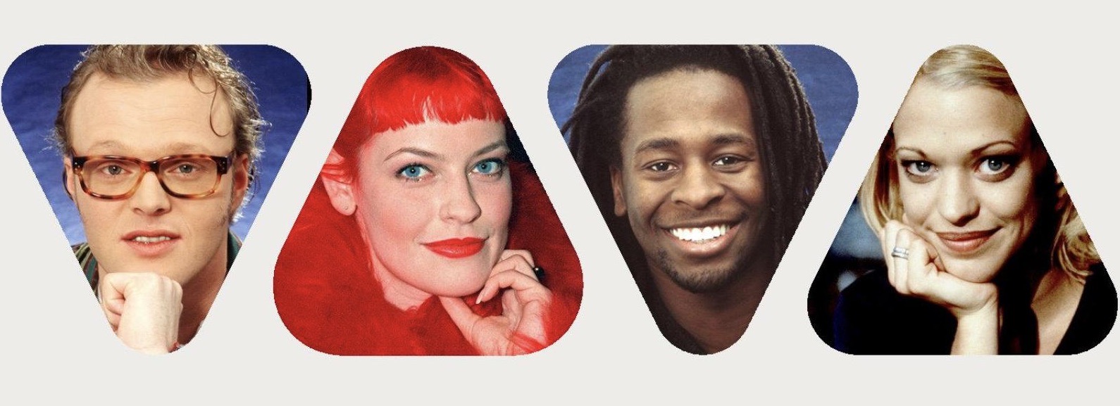
In the many years of cooperation with VIVA, we have developed 18 different campaigns that consolidated the TV station’s positioning as the spokesperson for youth. The campaign shown here as an example and only in excerpts is based on the idea of the unique. According to the media planning, 138 double-page advertisements were planned. We developed exactly 138 different, very special motifs for the individual media and months. No ad was the same as the other.
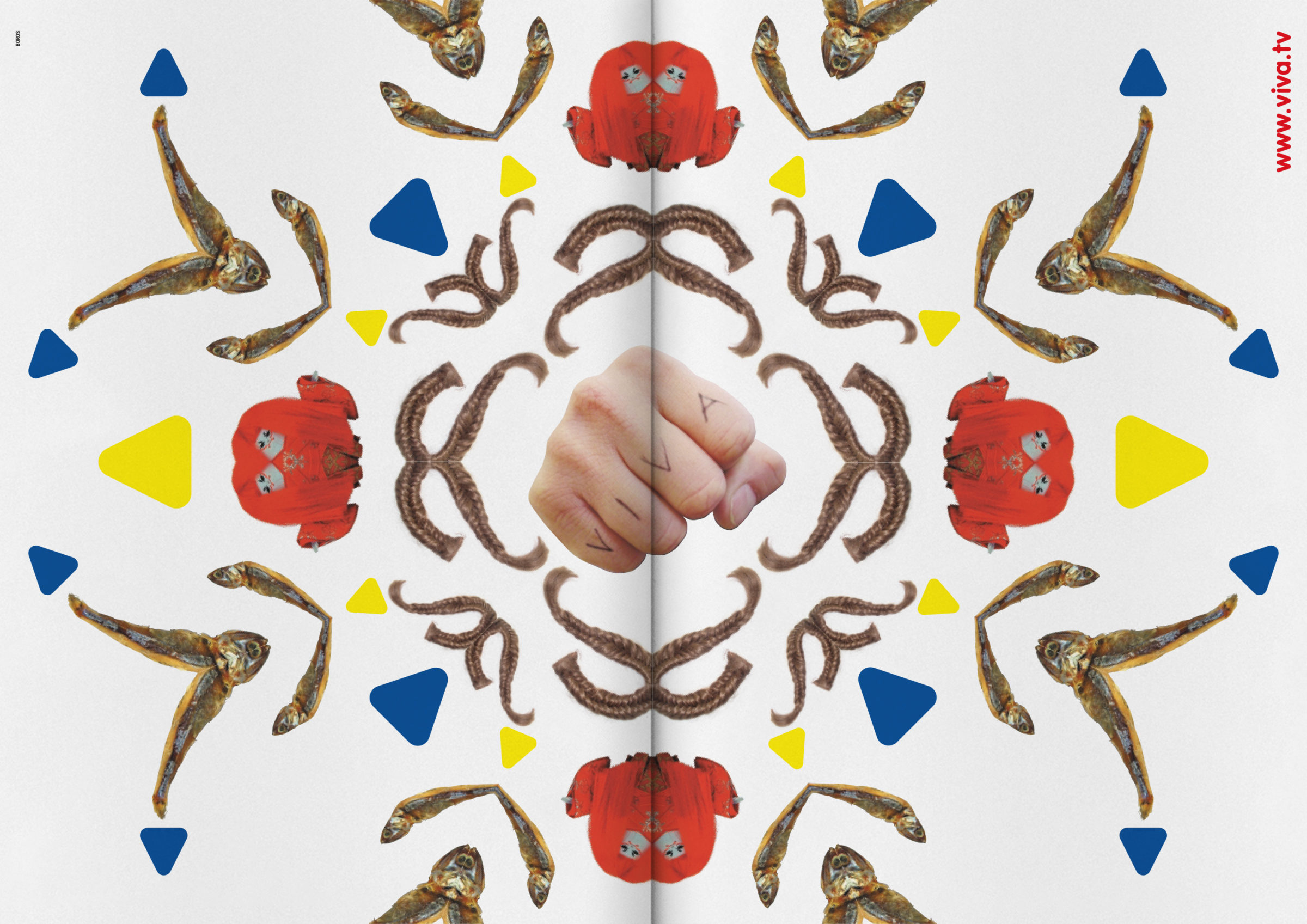
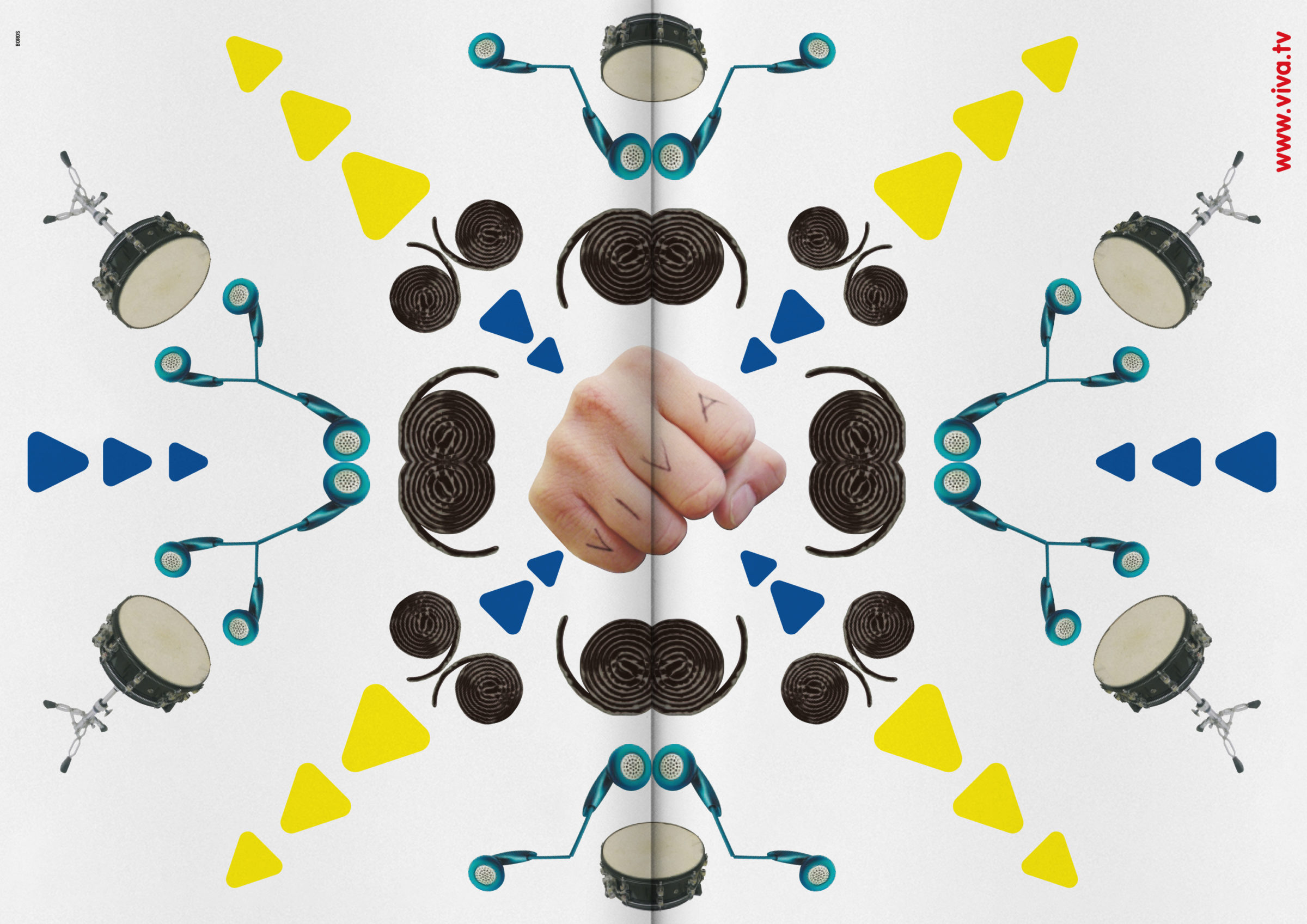
Even the logo elements, the familiar characeristic triangles in yellow and blue, were fractally used differently in each motif. The campaign was the pioneer of “fluid identity” and broke all the rules of rigid corporate identity. The VIVA logo was dissolved, yet it was still recognisable to the target group. A visual code developed that also worked fractally.
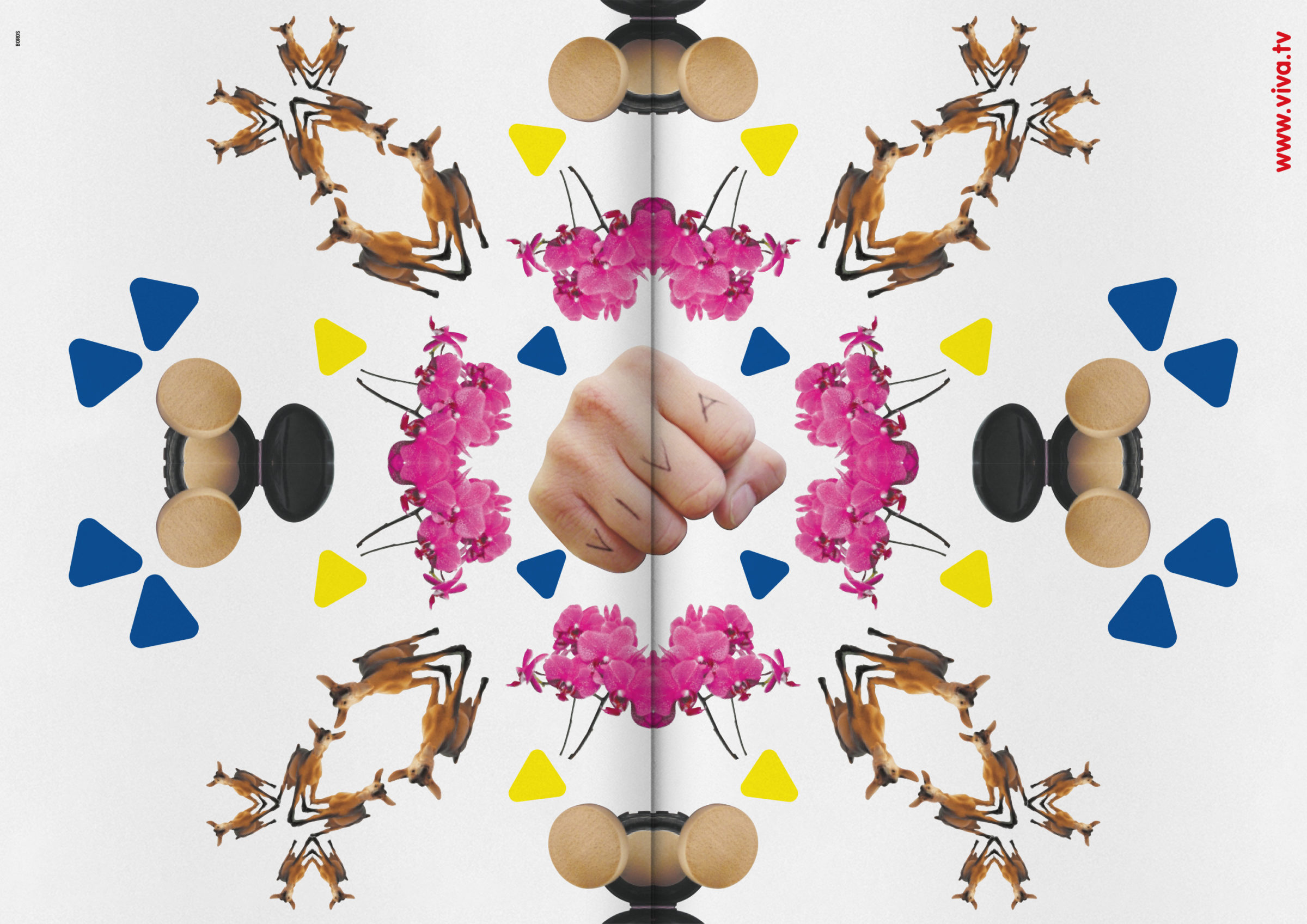
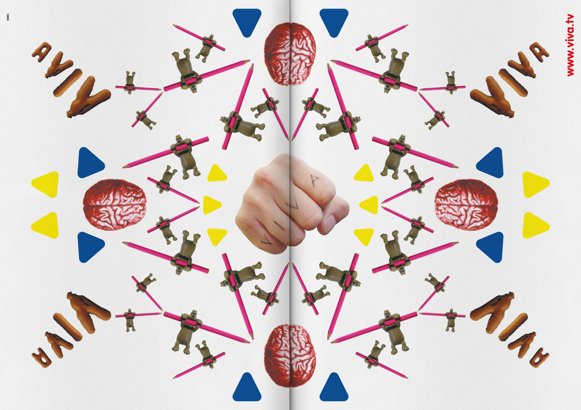
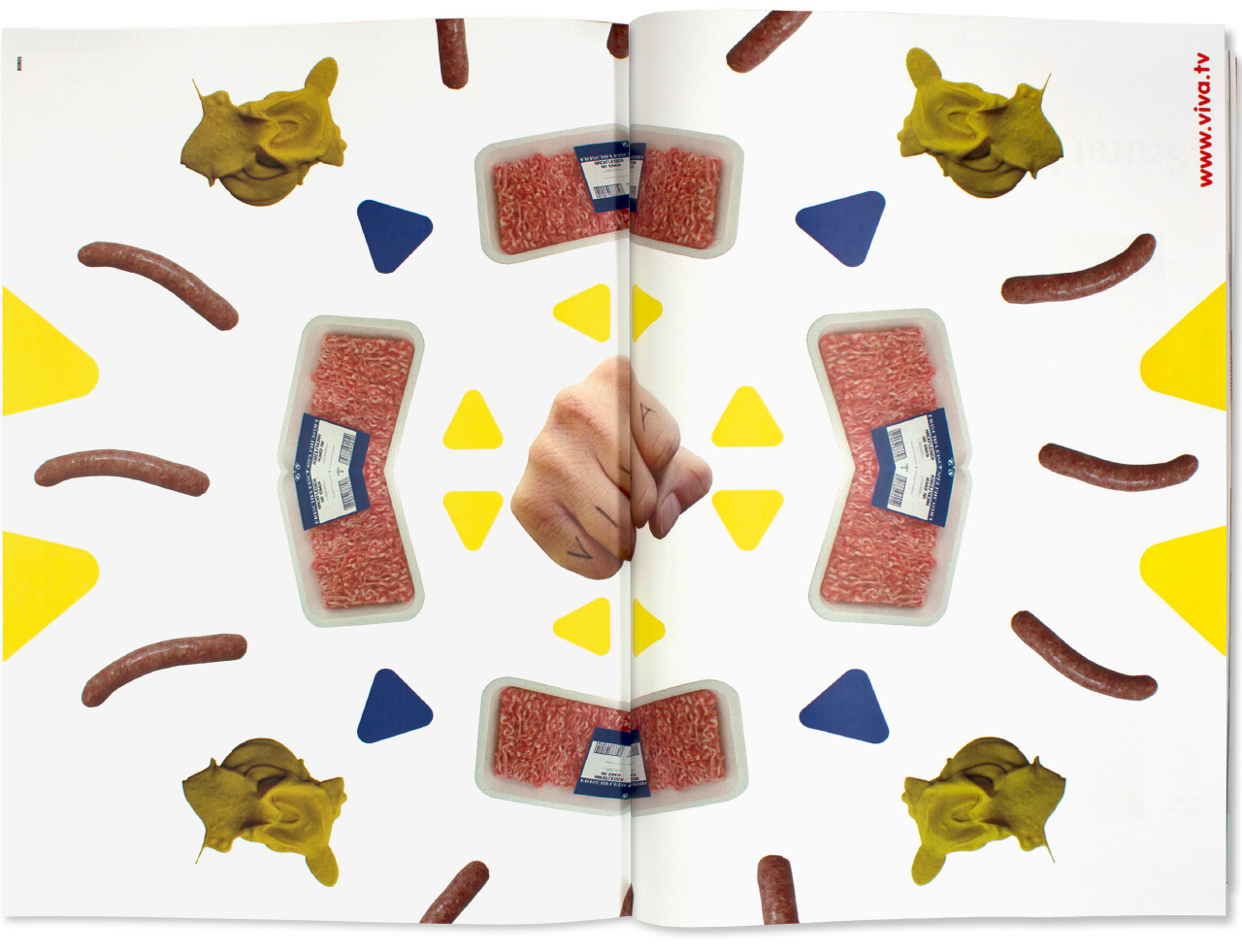
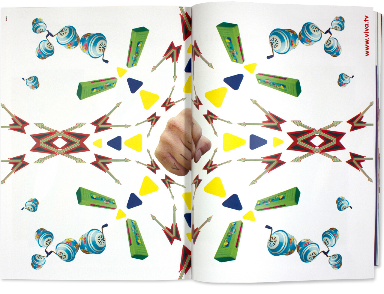
The Dadaist, kaleidoscopic combination of completely divergent pictorial elements was the pop-cultural implementation of sampling and the idea that the whole is more than the sum of its parts.
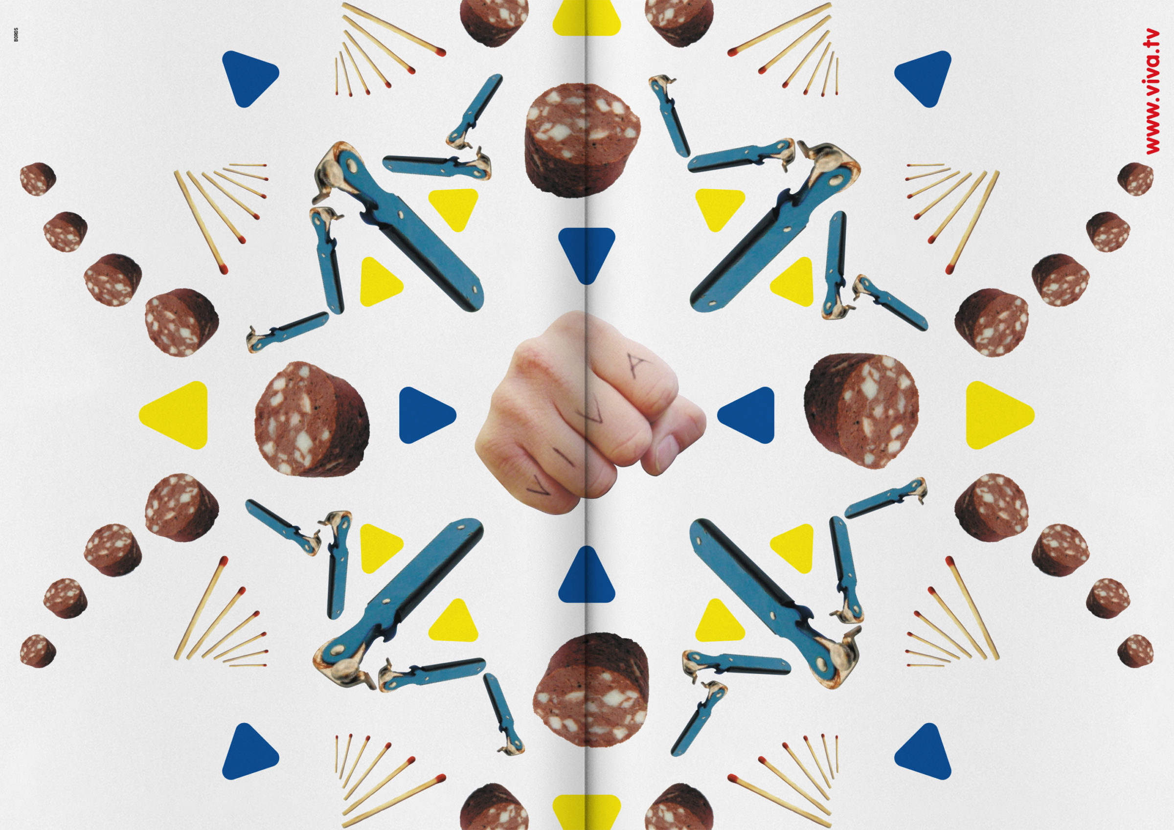
Provoking incomprehension was a strategic element of maximising coolness. 😉